It’s premium website design that makes one site trustworthy at once while some other site sends a user back to the search result. There’s nothing tricky about it: you can definitely notice a bad website by the number of fonts used and the time of first screen appearing, buttons hiding beyond the display.
Most people think this has to do with the money spent on the website. However, As a Digital Marketing Expert in Thrissur, who creates websites, all my experience shows me that expensive website design can be afforded by anyone. Here are the first seven elements that I usually pay attention to.
1. Minimalism in Luxury Website Design
Premium Website Design; Premium Website Design: The nature of luxury website design implies simplicity. Imagine two homepages offering the same service. One has a slider, 3 banners, a pop-up and five buttons. The other only has one headline and a button but it seems much more expensive whatever is the price of building it.
Give every section its own task, eliminate any design that does not help a user, and be uniform in use of spacing.The presence of buttons, cards, and images that follow identical rules throughout the site gives the impression of design being applied to it instead of a hastily assembled site. My web development and design services offer WordPress and Elementor development realizing such concept.
2. Typography and Type Combinations
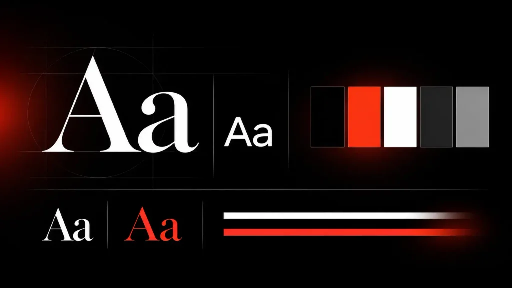
Premium Website Design; Typefaces create an impression before the text gets read; for example, a classy serif indicates traditionalism, geometric sansserif communicates modernity, while a messy combination doesn’t express anything in particular. Generally, there are no more than two type families needed – an expressive type for headers and a legible one for textual parts. Proper type combination means picking them not due to similarity but contrast.
For textual parts, I utilize fonts of the size 16-18pt with 1.5 line spacing. CSS clamp() used for fonts stops headlines from collapsing into five-line structures on smaller screens, meanwhile, by loading only those font weights that are used, one can save time significantly.
3. Strategic Use of Colour
Premium Website Design; In creating impressions, colour can be several times more efficient than text. High-end websites often employ a neutral colour, a primary corporate colour and an accent colour reserved f or key moments. The accent serves as an indicator of importance with a rule that the less frequently it is used, the more important it is going to be. A dark colour combined with white and one bright colour look striking, while a lighter neutral colour scheme has a soothing effect.
Contrast is a must. The WCAG recommends a minimum of 4.5:1 contrast, so check your combinations using a tool and not by visual judgement. Light grey text over black is one of the most common breaches.
4. Subtle Animations and Micro Interactions
Premium Website Design; Motion is justified only when it has a purpose. Movements like a button moving upon hovering over it or highlight of an active input field will let users know that the website is ready to respond to their actions. GSAP library with its ScrollTrigger plugin let you implement scroll-triggered animations practically.
It’s all about keeping it in balance. Too much animation can lead to slow pages, which result in an unpleasant experience for some users. In my projects, I usually try to stick to the 200-to-600-milliseconds animation range and use transforming, and opacity animation whenever possible, in respect to the prefers-reduced-motion feature. If the user notices the moving elements more than the main content, it means the use of animations is excessive.
5. Modern UI/UX design
Premium Website Design; UI deals with the aesthetics of a site and UX takes care of how well it performs and guides the visitors. As an expert in Digital Marketing Expert in Thrissur, I am of the view that a successful Premium Website Design integrates the two components to provide an easy and meaningful user experience. To do this, we need to know who uses the website, what they need, and what actions they should take. Navigation should be easy with a limited number of clear links, and every page must have only one precise call to action.
Accessibility also matters. This includes easy access through the keyboard, the use of descriptive hyperlink text, and proper descriptions of images through alt text. A neat, user-friendly Website helps create the first positive impression of the firm behind it. After all, even the most attractive site cannot be successful if it does not encourage visitors to make inquiries.
6. Responsive Website Design
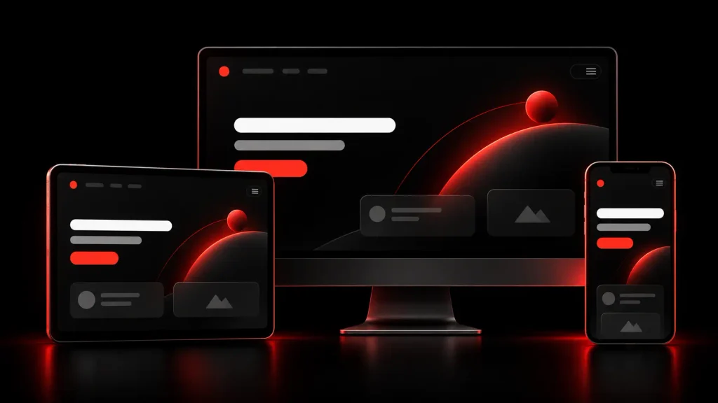
Mobile-first design refers to the development process where you start designing for the smallest screen and upwards scaling. This ensures that the critical aspects are taken care of at the beginning. If you are involved in Premium Website Design, then you already know that flexible grids, proper breakpoints, and appropriately sized images are essential. Ensure that the tap targets range from 44 to 48 pixels, with the right amount of space for the user to interact comfortably with your website. The mobile version, which contains a clear, well-designed menu, works better than the complex navigation layout on a desktop version. As a Digital Marketing Expert in Thrissur, I think the website should give the same level of experience no matter what device is being used to access it.
A good web page is a page that not only looks great on a desktop but also works well on a smartphone. You need to analyze your statistics in order to understand the behavior of mobile users and test the functionality on real devices.Go to web.dev’s Learn Responsive Design and check it out.
7. Optimization of Website Speed and Performance
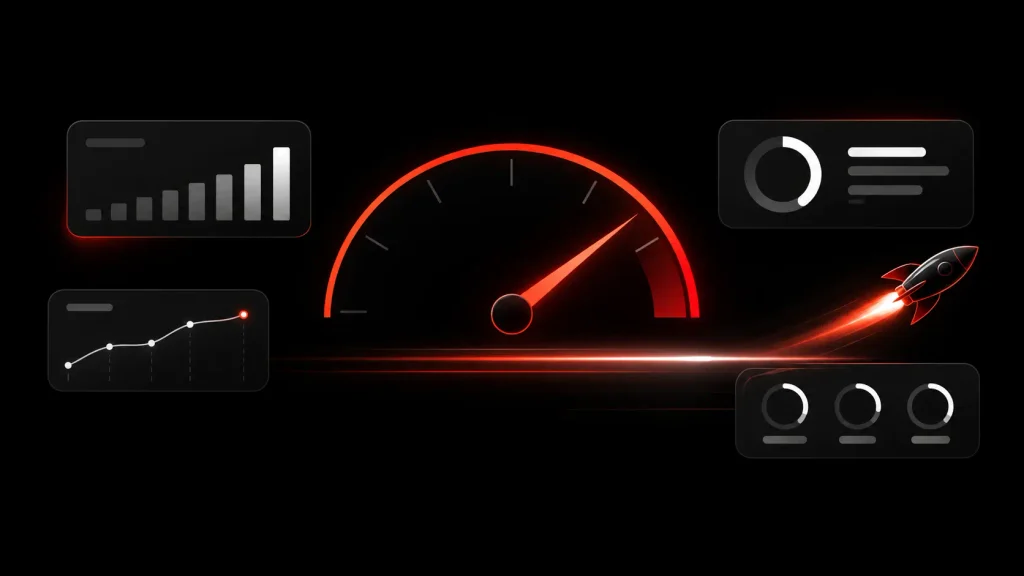
the impression of brokenness. Google uses Core Web Vitals to assess real-world experience. The thresholds published on web.dev show that for a page to fall into the “good” category, Largest Contentful Paint should take no longer than 2.5 seconds, Interaction to Next Paint – no longer than 200 milliseconds, and the Cumulative Layout Shift – no more than 0.1. Good scores will not guarantee good rankings, as page experience is only one of the elements but in any case slow and jumpy pages annoy people.
The solutions are usually not full of glamour. Step number one is to compress images and use either WebP or AVIF, followed by the need to set width and height parameters in such a way as to prevent any shifts on a page. There is a possibility to lazy-load images below the fold as well as scripts that are not needed at the moment. After that, it is necessary to measure the level of optimization in Google PageSpeed Insights, starting from the mobile version of a website and completing the testing process each time any significant modifications are applied. It should be noted that optimizing the page speed and preparing it for mobile access are included in the job description of my profession, yet search engine optimization implies much more than achieving good technical metrics, as I explain in my post on how SEO is changing in the age of AI.
Conclusion: Premium Web Design Lies in the Details
Premium Website Design; There is no one secret that makes a website premium. Layout, typeface, color, movement, usability, responsiveness, and load time should all be in harmony; removing or weakening one aspect of design can harm the whole web design. The good news is that achieving premium design mainly depends on sound decisions rather than large budget allocations.
If you are going to create a new website or need an honest consultation on the existing one, let me know. You can reach me, check my clients’ reviews, and find more details on the blog.